


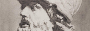


- Destroy this mad brute Poster
- Shaw or Irony Poster
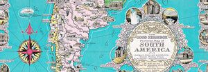
- The good neighbor of South America Poster
- Italy with Vatican City Poster
- Onions Poster
- Radishes Poster
- Carrots Poster
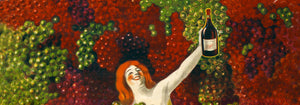
- Les Lalanne Poster
- Punch Boutique Poster
- Dancing couple in the snow Poster
- Judaism and Paganism Standpoint Poster
- Jet Clipper to Hawaii Poster
- Campari Soda Poster
- Bec-Kina Poster
- Kohler Chocolat Poster
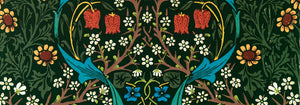
- Strawberry Thief Poster
- Matisse Dancing Figures Poster
- Tom Krojer Exhibition Poster Poster
- Berlin Street Scene Poster
- Ernst Kirchner Exhibition Poster
- Tour Eiffel 2 Poster
- Woman Seated Back Poster
- Red Hair Blue Hat Poster
- Park Near Lu Poster
- El Comienzo Poster
- Parler Seul 2 Poster
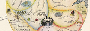
- The Current Standpoint of the Mahatmas Poster
- Twilight’s Ring Poster
- Parler Seul Poster
- Faun and Nymphe Poster
- The Dream Poster
- Le Concert Poster
- Bird passing through a Cloud Poster
-
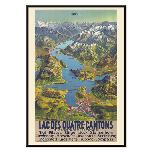
Lac Des Quatre-Cantons Poster
M. Bieder · 1935 · Swiss Lake Lucerne map poster with bright blue water and mountain relief
Poster from 222 Kč · Framed from 394,67 Kč
Regular price From 148,00 KčRegular price -
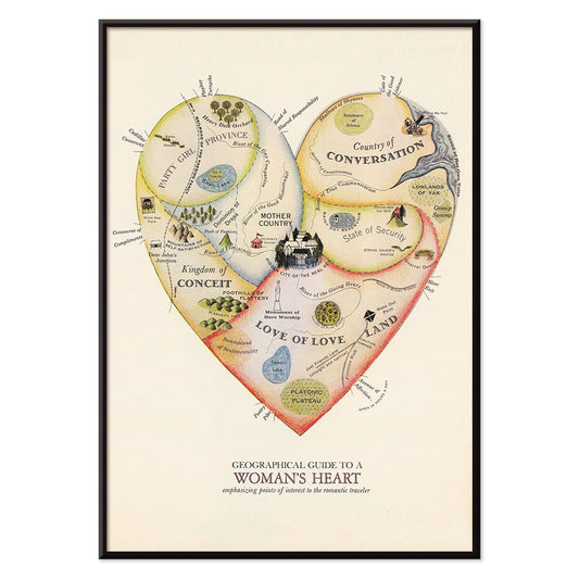
Geographical Guide to a Woman's Heart Poster
Jo Lowery · 1960 · Playful heart shaped map poster packed with witty labels and bright midcentury color
Poster from 222 Kč · Framed from 394,67 Kč
Regular price From 148,00 KčRegular price -
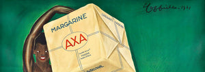
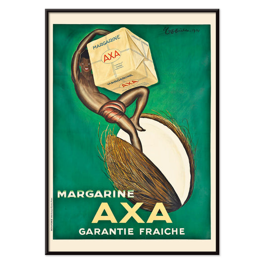
Margarine Axa Poster
Leonetto Cappiello · 1931 · Bold Margarine Axa poster with striking figure, green backdrop, and sunny yellow highlights
Poster from 222 Kč · Framed from 394,67 Kč
Regular price From 148,00 KčRegular price -
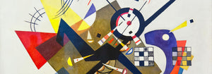
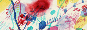
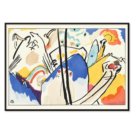
Der Blaue Reiter Poster
Wassily Kandinsky · 1914 · Expressive abstract poster with a blue rider silhouette and radiant color blocks
Poster from 222 Kč · Framed from 394,67 Kč
Regular price From 148,00 KčRegular price -
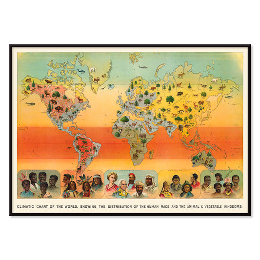
Climatic Chart of the World Poster
Levi Walter Yaggy · 1893 · Educational world climate poster featuring a global map with colorful animal and landscape scenes
Poster from 222 Kč · Framed from 394,67 Kč
Regular price From 148,00 KčRegular price -
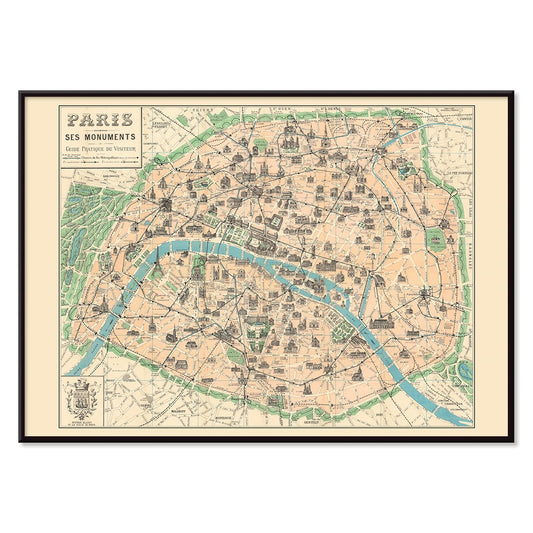
Paris Ses Monuments Poster
Borremans, F · 1924 · Illustrated Paris monuments poster featuring a central city map and landmark scenes
Poster from 222 Kč · Framed from 394,67 Kč
Regular price From 148,00 KčRegular price -
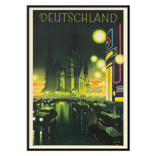
Deutschland Poster
Jupp Wiertz · 1927 · Glamorous night cityscape poster with glowing boulevard and cathedral skyline
Poster from 222 Kč · Framed from 394,67 Kč
Regular price From 148,00 KčRegular price -
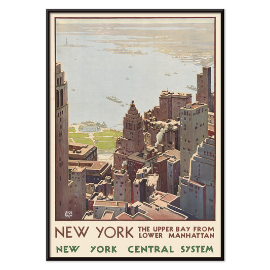
New York Central System Poster
Leslie Ragan · 1920 · Art Deco New York harbor poster with a sharp skyline and cool blue green tones
Poster from 222 Kč · Framed from 394,67 Kč
Regular price From 148,00 KčRegular price -
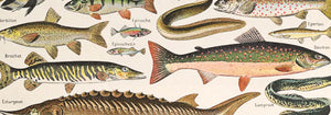
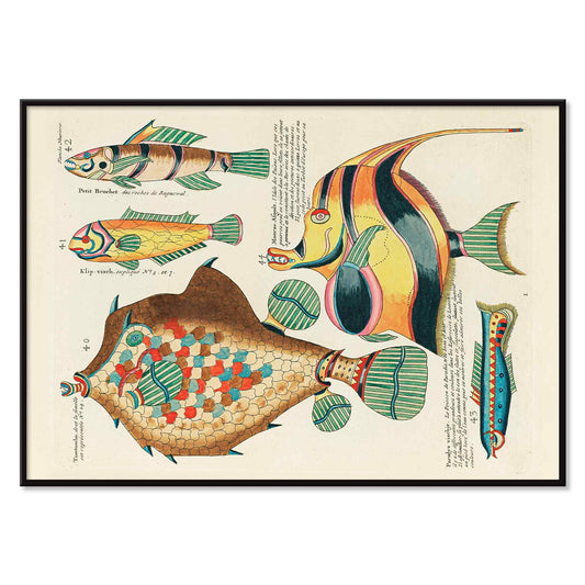
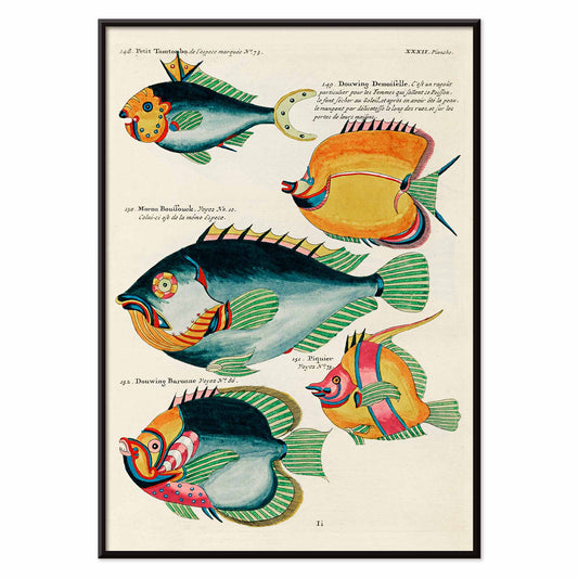
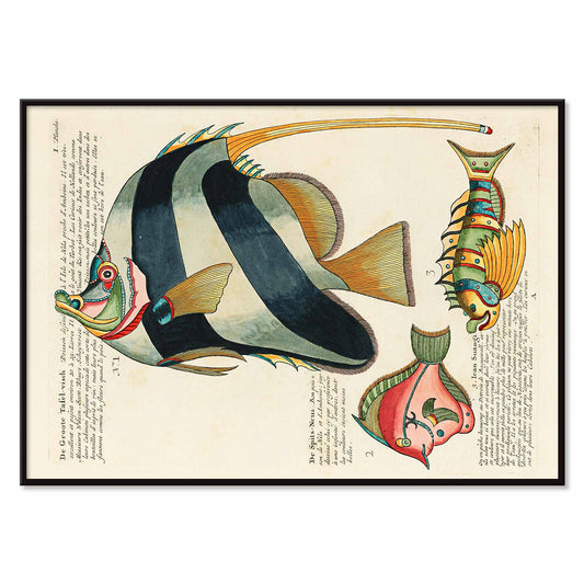
Colourful and surreal illustrations of fishes 9 Poster
Louis Renard · 1754 · Fantastical tropical fish print with jewel-like markings on an antique plate
Poster from 222 Kč · Framed from 394,67 Kč
Regular price From 148,00 KčRegular price -
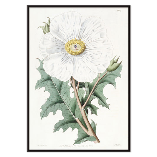
Mexican Poppy Poster
Sydenham Edwards · 1818 · Delicate Mexican poppy botanical print with pale petals, golden center, and crisp leaves
Poster from 222 Kč · Framed from 394,67 Kč
Regular price From 148,00 KčRegular price -
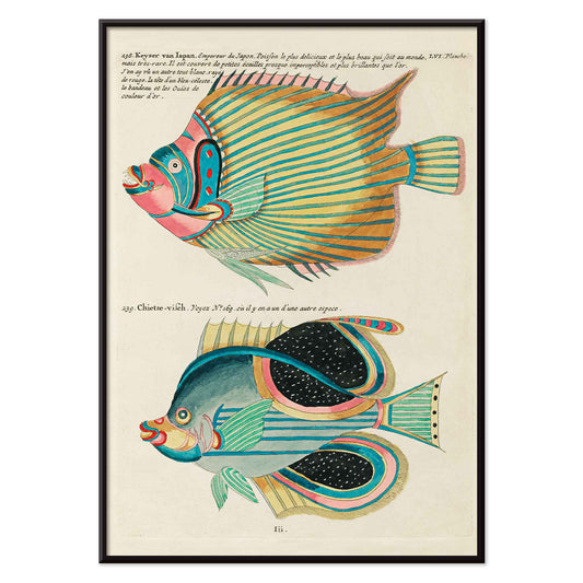
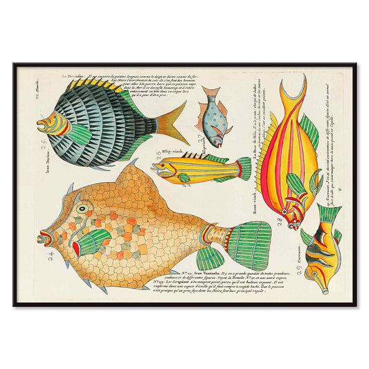
Colourful and surreal illustrations of fishes 8 Poster
Louis Renard · 1754 · Fantastical fish print with bold stripes, spots, and jewel like colors
Poster from 222 Kč · Framed from 394,67 Kč
Regular price From 148,00 KčRegular price -
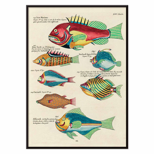
Colourful and surreal illustrations of fishes 7 Poster
Louis Renard · 1754 · Surreal tropical fish print with bold stripes and fantastical fins on white
Poster from 222 Kč · Framed from 394,67 Kč
Regular price From 148,00 KčRegular price -
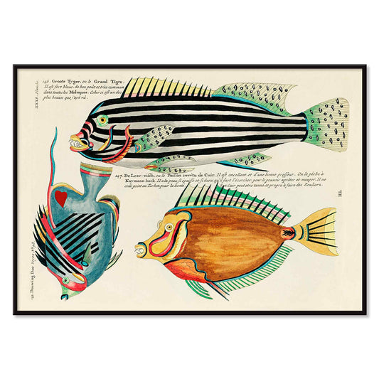
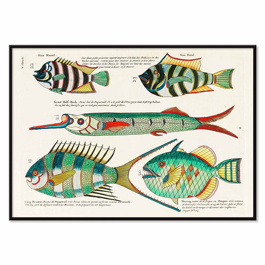
Colourful and surreal illustrations of fishes 6 Poster
Louis Renard · 1754 · Surreal tropical fish vintage print with vibrant colors and precise natural history linework
Poster from 222 Kč · Framed from 394,67 Kč
Regular price From 148,00 KčRegular price -
Colourful and surreal illustrations of fishes 5 Poster
Louis Renard · 1754 · Vivid tropical fish print featuring ornate patterns and bright colors on a pale background
Poster from 222 Kč · Framed from 394,67 Kč
Regular price From 148,00 KčRegular price -
Colourful and surreal illustrations of fishes 4 Poster
Louis Renard · 1754 · Surreal tropical fish print with bold hand-colored forms on a clean specimen page
Poster from 222 Kč · Framed from 394,67 Kč
Regular price From 148,00 KčRegular price -
Colourful and surreal illustrations of fishes 3 Poster
Louis Renard · 1754 · Vivid fish vintage print with whimsical patterns floating on clean white space
Poster from 222 Kč · Framed from 394,67 Kč
Regular price From 148,00 KčRegular price -
Colourful and surreal illustrations of fishes 2 Poster
Louis Renard · 1754 · Vivid tropical fish scientific print featuring bold stripes and whimsical specimen arrangement
Poster from 222 Kč · Framed from 394,67 Kč
Regular price From 148,00 KčRegular price -
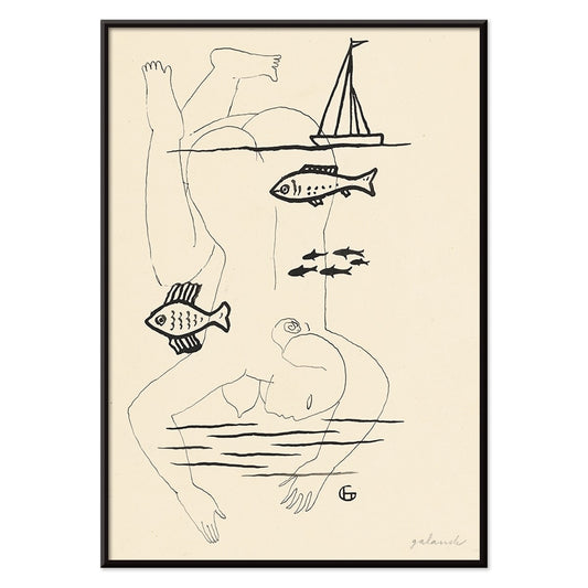
Drowned Poster
Mikuláš Galanda · 1930 · Surreal black-and-white poster merging human fragility with an aquatic fish motif
Poster from 222 Kč · Framed from 394,67 Kč
Regular price From 148,00 KčRegular price -
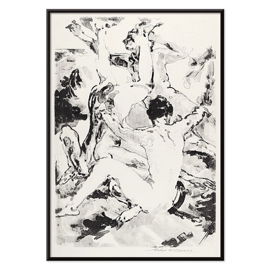
Three Acrobats Poster
Arthur Bowen Davies · 1920 · Lithe circus figures in a black and white art print with rhythmic modernist line
Poster from 222 Kč · Framed from 394,67 Kč
Regular price From 148,00 KčRegular price -
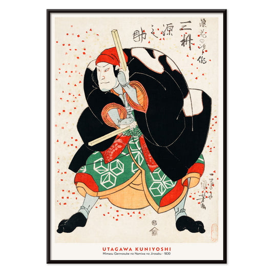
Mimasu Gennosuke Poster
Utagawa Kuniyoshi · 1830 · Dramatic kabuki warrior art print with bold patterns and vivid red accents
Poster from 222 Kč · Framed from 394,67 Kč
Regular price From 148,00 KčRegular price -
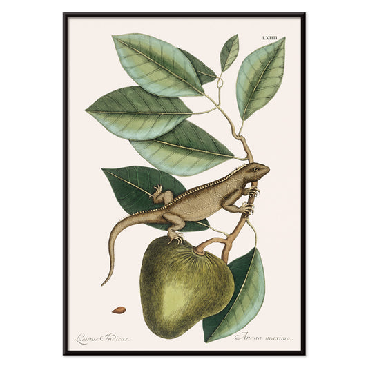
Guana Poster
Mark Catesby · 1754 · Elegant iguana print perched on a branch with natural history precision
Poster from 222 Kč · Framed from 394,67 Kč
Regular price From 148,00 KčRegular price -
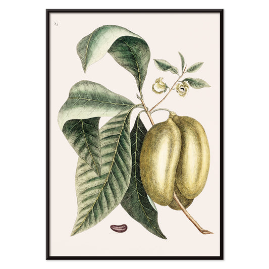
Pawpaw Poster
Mark Catesby · 1754 · Graceful pawpaw botanical print with broad green leaves and ripening fruit on ivory ground
Poster from 222 Kč · Framed from 394,67 Kč
Regular price From 148,00 KčRegular price -
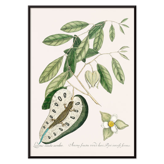
Blue Tail Lizard Poster
Mark Catesby · 1754 · Lively natural history print of a lizard with vivid blue tail and poised stance
Poster from 222 Kč · Framed from 394,67 Kč
Regular price From 148,00 KčRegular price -
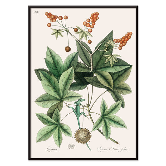
Green Lizard Poster
Mark Catesby · 1754 · Natural history vintage print featuring a green lizard poised among leafy branches
Poster from 222 Kč · Framed from 394,67 Kč
Regular price From 148,00 KčRegular price -
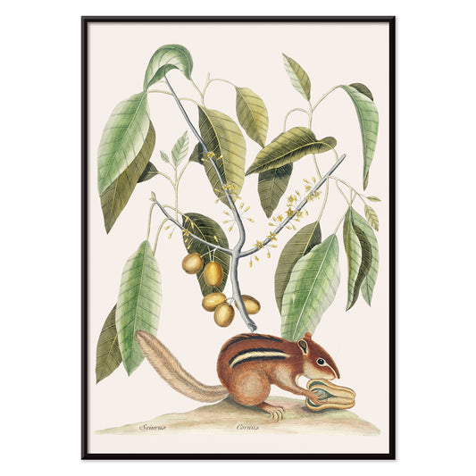
Ground Squirrel Poster
Mark Catesby · 1754 · Detailed ground squirrel print posed among leafy branches on warm beige paper
Poster from 222 Kč · Framed from 394,67 Kč
Regular price From 148,00 KčRegular price -
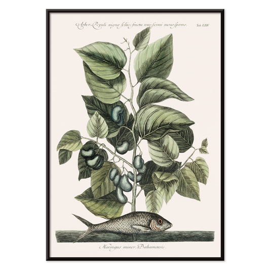
Pilchard Poster
Mark Catesby · 1754 · Natural history pilchard vintage print pairing a silvery fish with coastal greenery
Poster from 222 Kč · Framed from 394,67 Kč
Regular price From 148,00 KčRegular price -
Globe Fish Poster
Mark Catesby · 1754 · Elegant globe fish print with fine linework and soft green natural history tones
Poster from 222 Kč · Framed from 394,67 Kč
Regular price From 148,00 KčRegular price -
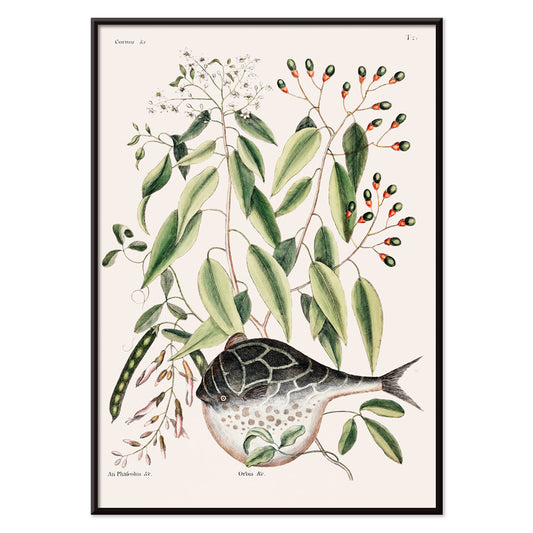
Ivory-billed Woodpecker Poster
Mark Catesby · 1754 · Hand-colored bird print showing an ivory-billed woodpecker poised on a tree trunk
Poster from 222 Kč · Framed from 394,67 Kč
Regular price From 148,00 KčRegular price -
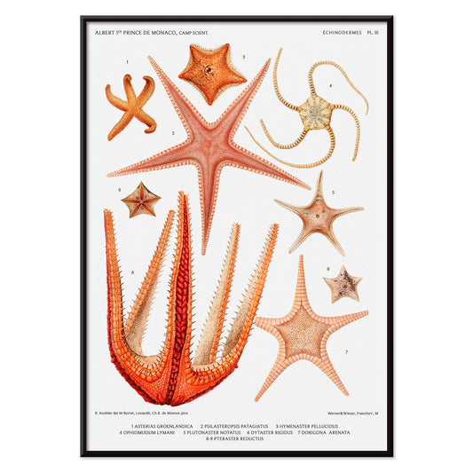
Starfish varieties 3 Poster
Albert I · 1885 · Detailed starfish vintage print arranged like a natural history plate in coral tones
Poster from 222 Kč · Framed from 394,67 Kč
Regular price From 148,00 KčRegular price -
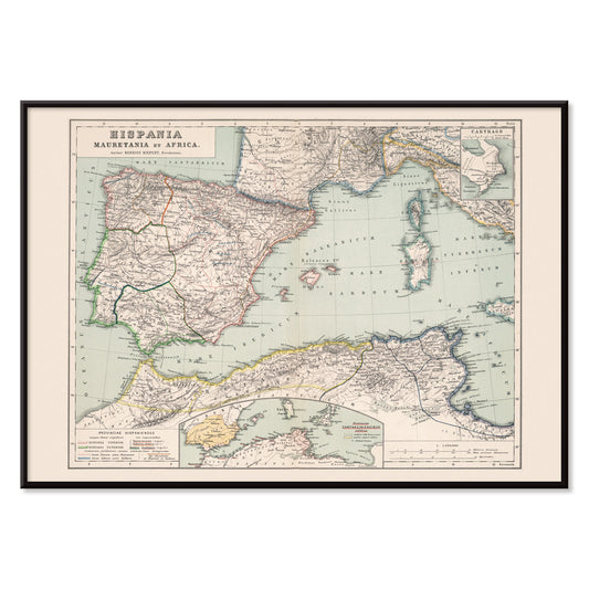
Hispania Poster
Heinrich Kiepert · 1850 · Detailed map poster of Roman Hispania with colored provinces and fine place names
Poster from 222 Kč · Framed from 394,67 Kč
Regular price From 148,00 KčRegular price -
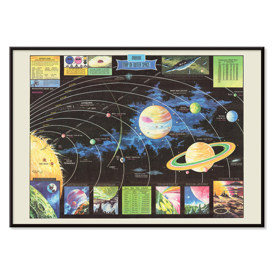
Map of Outer Space Poster
Rand McNally & Co · 1969 · Mid-century solar system poster with crisp labels and orbit lines on deep black
Poster from 222 Kč · Framed from 394,67 Kč
Regular price From 148,00 KčRegular price -
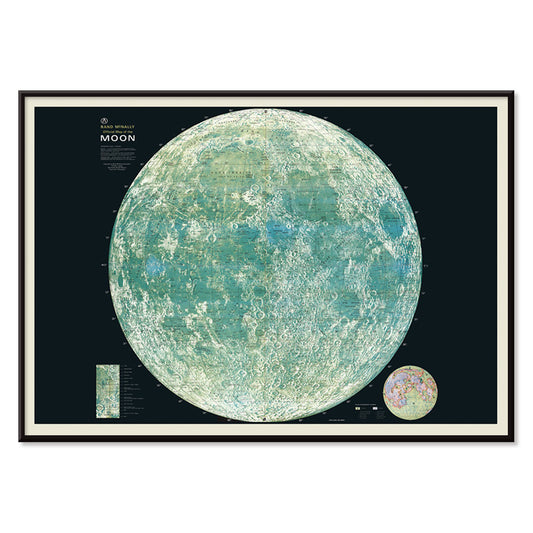
Map of the moon Poster
Rand McNally & Co · 1958 · Detailed lunar cartography poster with labeled craters and clean mid-century map typography
Poster from 222 Kč · Framed from 394,67 Kč
Regular price From 148,00 KčRegular price -
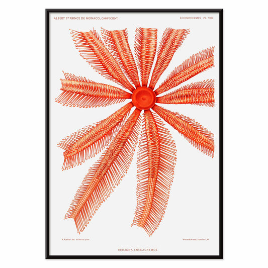
Brisingidae Poster
Albert I · 1898 · Striking Brisingidae sea star scientific print with radiating arms in coral red tones
Poster from 222 Kč · Framed from 394,67 Kč
Regular price From 148,00 KčRegular price -
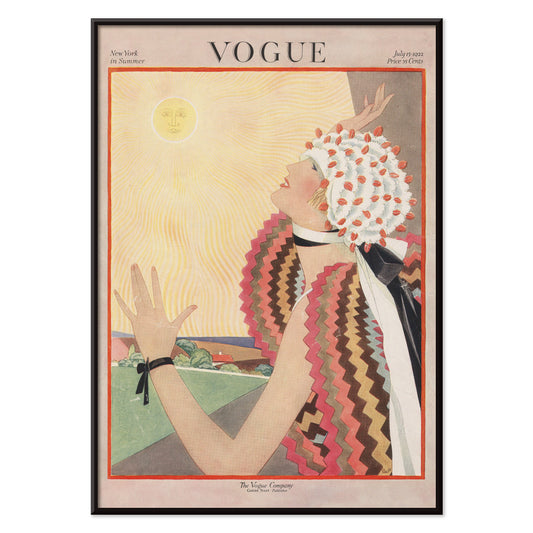
Vogue Poster
George Plank · 1921 · Optimistic Vogue poster with a stylized figure reaching toward the sun
Poster from 222 Kč · Framed from 394,67 Kč
Regular price From 148,00 KčRegular price -
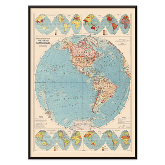
Western Hemisphere Poster
Rand McNally & Co · 1940 · Detailed Western Hemisphere map poster with crisp grids and classic nautical blue seas
Poster from 222 Kč · Framed from 394,67 Kč
Regular price From 148,00 KčRegular price -
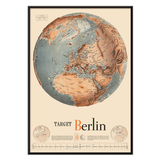
Army Orientation Course Poster
F.E. Manning · 1940 · WWII instructional poster featuring a globe map and bold Target Berlin motif in blue
Poster from 222 Kč · Framed from 394,67 Kč
Regular price From 148,00 KčRegular price


36/1749 items
- Lac Des Quatre-Cantons Poster
- Geographical Guide to a Woman's Heart Poster
- Margarine Axa Poster
- Der Blaue Reiter Poster
- Climatic Chart of the World Poster
- Colourful and surreal illustrations of fishes 6 Poster
- Colourful and surreal illustrations of fishes 5 Poster
- Mimasu Gennosuke Poster
- Starfish varieties 3 Poster
- Map of Outer Space Poster
- Brisingidae Poster
- Vogue Poster
- Army Orientation Course Poster
An archive of images, not a single style
All Posters is where MORYARTY reads like a cabinet of curiosities: art print classics beside travel scenes, graphic experiments beside quiet studies of nature. Rather than a single movement, the selection suggests a social history of looking, where ink on paper met crowds, shops, salons, and stations. Across eras, certain instincts return: bold typography, expressive line, and the way a poster can adjust a room’s mood from café warmth to museum hush. For a tighter focus inside this breadth, move between Advertising and Classic Art to feel how public images and private taste often borrow from one another.
How posters were printed and why it matters
Many works in this collection were designed to be read at speed. Stone lithography made broad fields of colour possible, with velvety blacks and a softness at the edge that still feels human. Later processes, including offset printing, sharpened contours and allowed larger runs, changing how colour sits on the page. You can often spot the method in the surface: halftone dots, overprinted inks, and slight misregistration that gives vintage colour a gentle vibration. Those details are not flaws so much as evidence of making. If you enjoy disciplined negative space and line, the calm structure of Oriental pairs well with the spare clarity of Minimalist, where silence becomes part of the design.
Using wall art to shape a room
Because this is a wide spectrum, start with the room’s materials and light. In a kitchen with oak, stoneware, or terrazzo, a botanical poster can echo grain and scent-memory; Botanical brings greens that sit comfortably with warm neutrals. In a living room of chrome, glass, and clean-lined furniture, the geometry of Abstract keeps the atmosphere crisp, especially when you repeat one accent colour in textiles. Bedrooms often respond to restraint: Black & White prints read like quiet conversation and sit well with linen, wool, and low, warm lamps.
Curating, pairing, and framing across eras
A gallery wall works best when it has tempo. Pair one text-forward sheet with one image-led composition, then let margins do the pacing. If you mix periods, keep a shared element such as paper tone, repeated red, or consistent line weight. Thin black frames push graphic posters forward; pale oak softens high contrast and suits Scandinavian-leaning home decor. Hang larger posters slightly lower than you expect so the image meets the eye, then cluster smaller prints nearer shelves so objects can echo shapes on paper. When you want the wall to feel intentionally edited, one hero work and two supporting pieces often reads more clearly than a dense grid.
The pleasure of browsing widely
What holds the All Posters collection together is its democratic origin: images meant to be pinned, traded, and lived with. Choose one print that keeps your gaze for longer than expected, then build outward with neighbouring colours and related line. If you want structure while you browse, try switching between Vertical Posters and Horizontal Posters to see how format alone can change the feeling of a wall. For framing ideas, the calmer profile of Frames can help unify mixed eras without flattening their differences.