


- Destroy this mad brute Poster
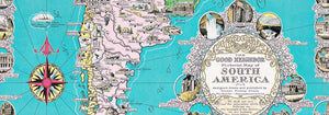
- The good neighbor of South America Poster
- Italy with Vatican City Poster
- Les Lalanne Poster
- Dancing couple in the snow Poster
- Jet Clipper to Hawaii Poster
- Kohler Chocolat Poster
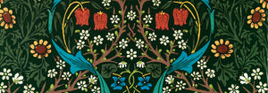
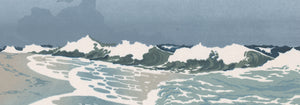
- Strawberry Thief Poster
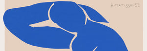
- Matisse Dancing Figures Poster
- Tom Krojer Exhibition Poster Poster
- Berlin Street Scene Poster
- Ernst Kirchner Exhibition Poster
- Woman Seated Back Poster
- Red Hair Blue Hat Poster
- Park Near Lu Poster
- El Comienzo Poster
- Parler Seul 2 Poster
- Twilight’s Ring Poster
- Parler Seul Poster
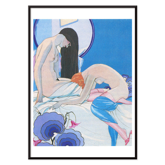
- The Dream Poster
- Le Concert Poster
- Female Artist Poster
- Revenge of the Pink Panther Poster
- Woman and Bird at Night Poster
- Visit Puerto Rico Poster
- Bauhaus 20 Poster
- Bauhaus 21 Poster
- Eat more fruits Poster
- Blue Japanese Crane Poster
- Snoopy come home Poster
- To London by Jet Clipper Poster
- Crans Poster
- Monte Carlo Poster
- Pacific Vibrations Poster
- Continental Hawaii Airline Poster
- Beer and Cigarette Poster
- West Coast of Mexico Poster
-
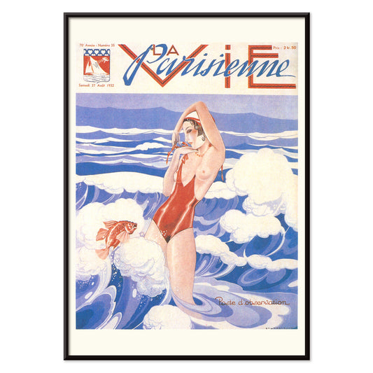
La Vie Parisienne Poster
Umberto Brunelleschi · 1932 · Art Deco poster featuring a confident woman in a red swimsuit on blue and white
Poster from 223,50 Kč · Framed from 397,33 Kč
Regular price From 149,00 KčRegular price -
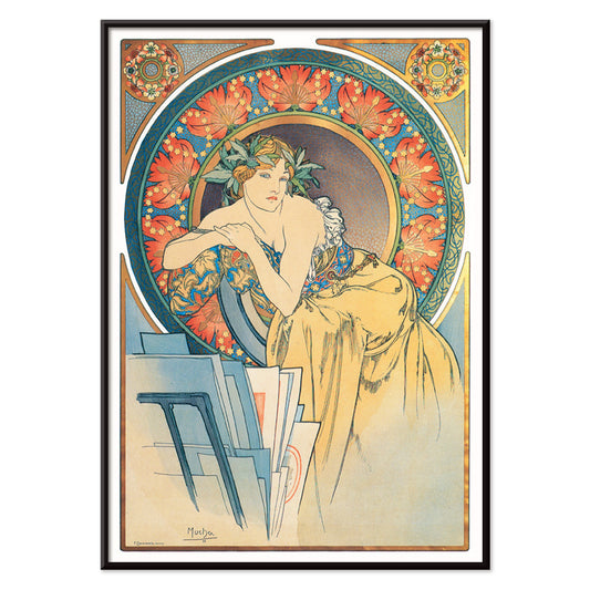
Woman with poppies by Alphonse Mucha Poster
Alphonse Mucha · 1899 · Elegant Art Nouveau poster featuring a tranquil woman encircled by vivid red poppies
Poster from 223,50 Kč · Framed from 397,33 Kč
Regular price From 149,00 KčRegular price -
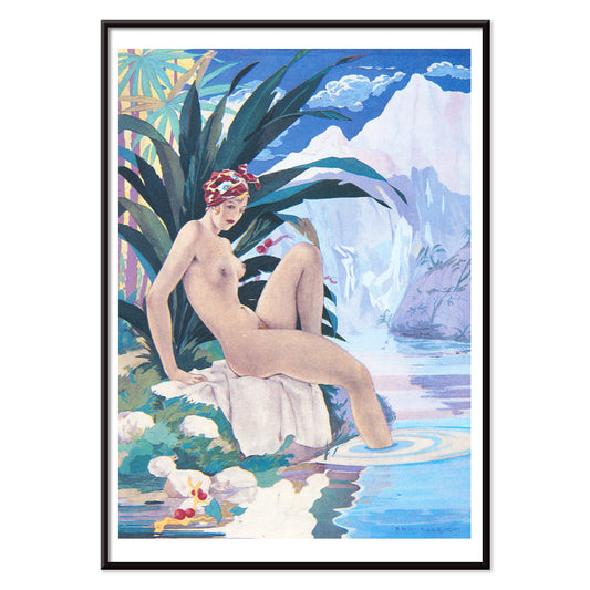
Paul et Virginie di B. de Saint-Pierre Poster
Umberto Brunelleschi · 1940 · Sensual Art Deco poster of a reclining nude framed by tropical palms
Poster from 223,50 Kč · Framed from 397,33 Kč
Regular price From 149,00 KčRegular price -
Les Aventures du Roi Pausole Poster
Umberto Brunelleschi · 1935 · Art Deco erotic poster featuring a poised figure in cool blue and soft pink
Poster from 223,50 Kč · Framed from 397,33 Kč
Regular price From 149,00 KčRegular price -
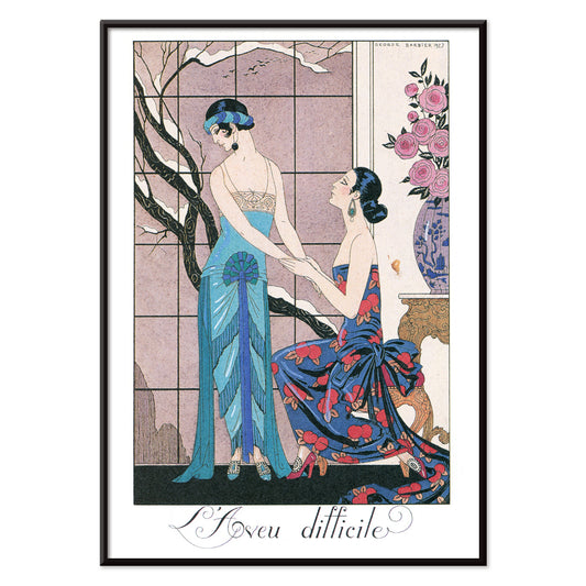
L’aveu Difficile Poster
George Barbier · 1924 · Art Deco fashion poster featuring poised figures and theatrical elegance in jewel tones
Poster from 223,50 Kč · Framed from 397,33 Kč
Regular price From 149,00 KčRegular price -
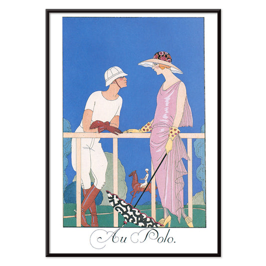
Au Polo Poster
George Barbier · 1924 · Chic Art Deco polo poster with poised silhouettes and refined color contrasts
Poster from 223,50 Kč · Framed from 397,33 Kč
Regular price From 149,00 KčRegular price -
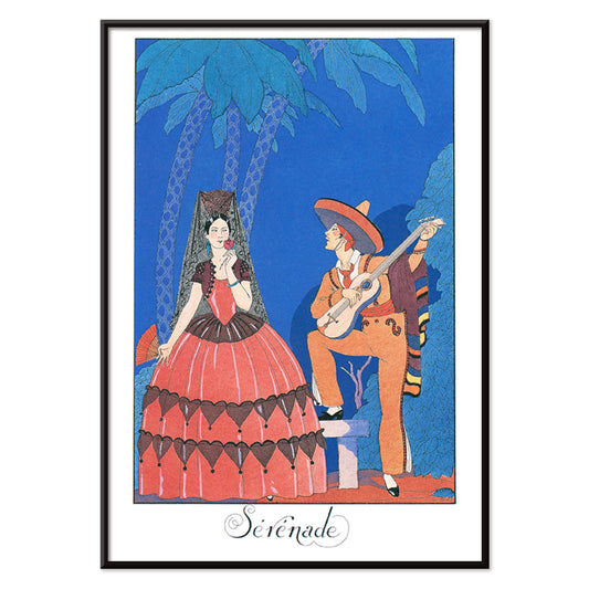
Sérénade Poster
George Barbier · 1924 · Elegant Art Deco poster featuring a blue-clad musician serenading a woman in orange
Poster from 223,50 Kč · Framed from 397,33 Kč
Regular price From 149,00 KčRegular price -
The responsive eye Poster
Patrick Blackwell · 1965 · Op art poster with red concentric circles and a staring eye on blue
Poster from 223,50 Kč · Framed from 397,33 Kč
Regular price From 149,00 KčRegular price -
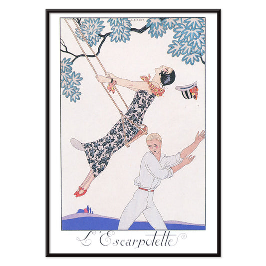
L’Escarpotette Poster
George Barbier · 1924 · Playful Art Deco poster of a chic figure on a swing in blue
Poster from 223,50 Kč · Framed from 397,33 Kč
Regular price From 149,00 KčRegular price -
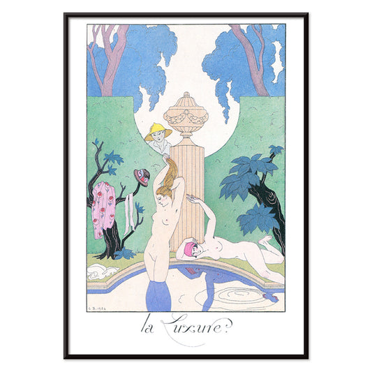
La Luxure Poster
George Barbier · 1924 · Sensual Art Deco print featuring stylized nude figures framed by lush garden motifs
Poster from 223,50 Kč · Framed from 397,33 Kč
Regular price From 149,00 KčRegular price -
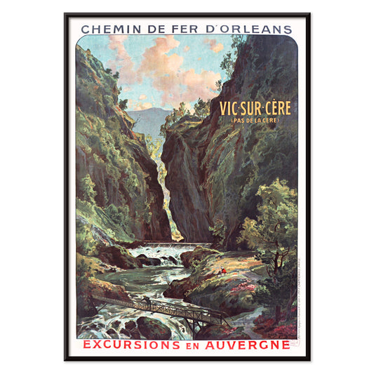
Vic sur Cère Poster
Louis Tauzin · 1905 · Refined French travel poster showing Vic sur Cere gorge and river in Auvergne
Poster from 223,50 Kč · Framed from 397,33 Kč
Regular price From 149,00 KčRegular price -
Big Bingo Poster
Unknown artist · 1916 · Vibrant circus poster featuring a towering elephant beside its poised trainer
Poster from 223,50 Kč · Framed from 397,33 Kč
Regular price From 149,00 KčRegular price -
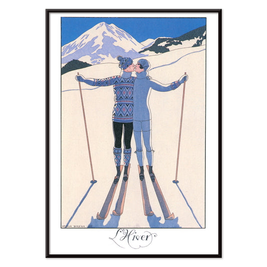
L’Hiver Poster
George Barbier · 1924 · Romantic Art Deco poster featuring a couple embracing in a crisp winter landscape
Poster from 223,50 Kč · Framed from 397,33 Kč
Regular price From 149,00 KčRegular price -
L’Eau Poster
George Barbier · 1924 · Elegant Art Deco poster of waterside leisure in vivid blue with pink accents
Poster from 223,50 Kč · Framed from 397,33 Kč
Regular price From 149,00 KčRegular price -
La Terre Poster
George Barbier · 1924 · Elegant Art Deco poster of women and child harvesting fruit in a stylized garden
Poster from 223,50 Kč · Framed from 397,33 Kč
Regular price From 149,00 KčRegular price -
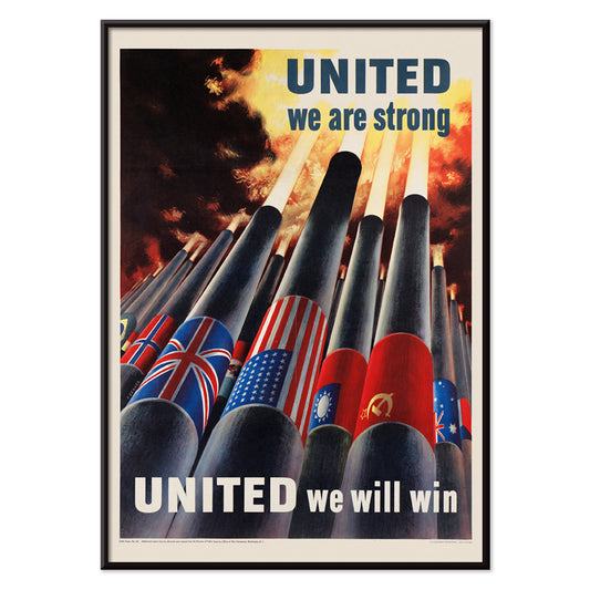
United we are strong Poster
Henry Koerner · 1943 · WWII poster featuring Allied flags rising above cannons in bold graphic style
Poster from 223,50 Kč · Framed from 397,33 Kč
Regular price From 149,00 KčRegular price -
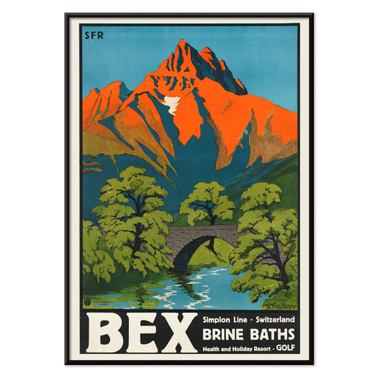
Bex Brine Baths Poster
Aime-Felix Nicollerat · 1896 · Alpine spa resort poster with stone bridge, rushing river, and radiant mountain peaks
Poster from 223,50 Kč · Framed from 397,33 Kč
Regular price From 149,00 KčRegular price -
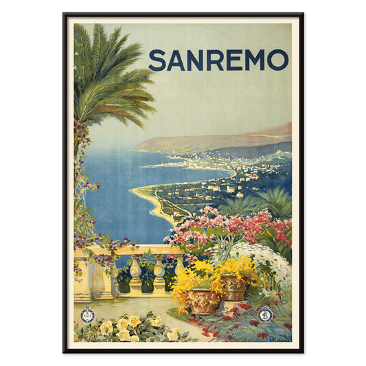
Sanremo Poster
Unknown artist · 1920 · Sunlit Sanremo travel poster with flowered foreground, palms, and a bright Mediterranean bay
Poster from 223,50 Kč · Framed from 397,33 Kč
Regular price From 149,00 KčRegular price -
Las Vegas – fly TWA Poster
David Klein · 1962 · Vibrant Las Vegas travel poster featuring a showgirl, neon signage, and TWA flair
Poster from 223,50 Kč · Framed from 397,33 Kč
Regular price From 149,00 KčRegular price -
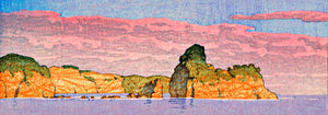
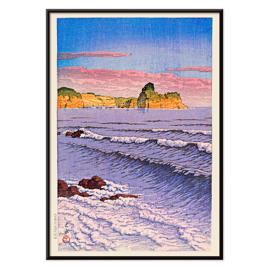
Souvenirs of My Travels Poster
Kawase Hasui · 1940 · Serene coastal poster showing a cavern in dark cliffs above bright surf
Poster from 223,50 Kč · Framed from 397,33 Kč
Regular price From 149,00 KčRegular price -
Morning Sea at Bikuni in Shiribeshi Poster
Kawase Hasui · 1933 · Serene shin hanga art print of fishing boats on calm blue water under a misty horizon
Poster from 223,50 Kč · Framed from 397,33 Kč
Regular price From 149,00 KčRegular price -
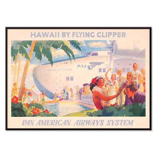
Hawaii by flying clipper Poster
Unknown artist · 1938 · Iconic Hawaii travel poster with Pan American clipper and welcoming lei motif
Poster from 223,50 Kč · Framed from 397,33 Kč
Regular price From 149,00 KčRegular price -
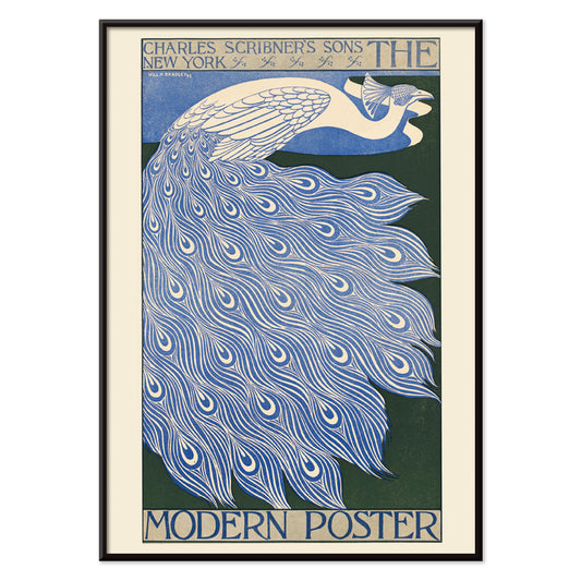
The modern poster Poster
Will Bradley · 1895 · Stylized peacock poster with flowing Art Nouveau lines and crisp blue-white contrast
Poster from 223,50 Kč · Framed from 397,33 Kč
Regular price From 149,00 KčRegular price -
Torrefazione F.Kluzer Poster
Carlo Piquillo Pandolfi · 1930 · Italian Art Deco coffee poster with a bold cup motif and geometric color blocks
Poster from 223,50 Kč · Framed from 397,33 Kč
Regular price From 149,00 KčRegular price -
A la Place Clichy Poster
Eugène Grasset · 1891 · Art Nouveau Paris poster featuring a stylish woman and bold blue-orange palette
Poster from 223,50 Kč · Framed from 397,33 Kč
Regular price From 149,00 KčRegular price -
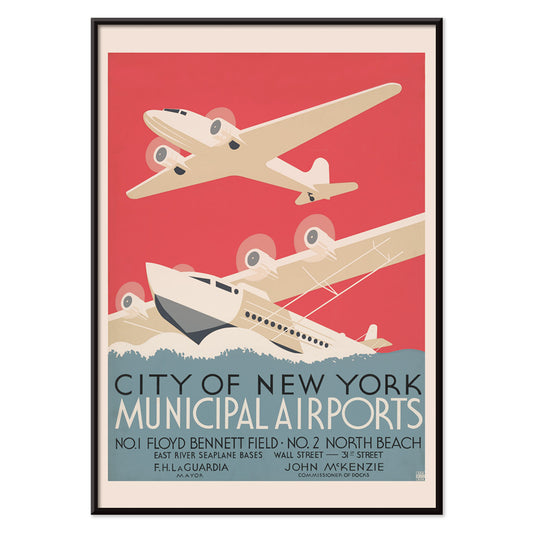
City of New York municipal airports Poster
Unknown artist · 1938 · Streamlined Art Deco aviation poster of New York airports above stylized water and skyline
Poster from 223,50 Kč · Framed from 397,33 Kč
Regular price From 149,00 KčRegular price -
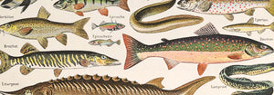
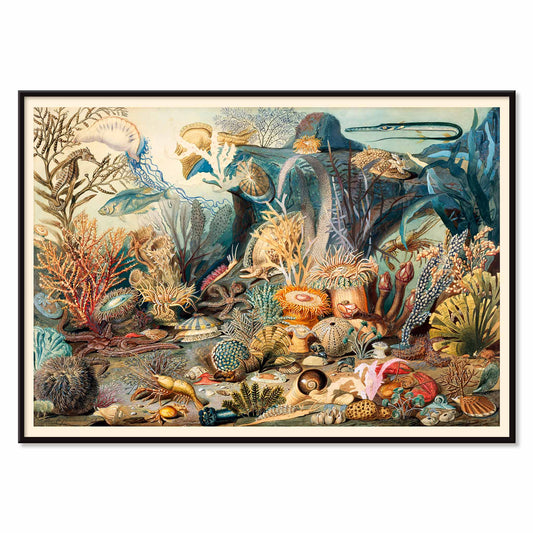
Ocean Life Poster
James M. Sommerville · 1862 · Detailed ocean life print featuring corals, fish, and shells in luminous coastal tones
Poster from 223,50 Kč · Framed from 397,33 Kč
Regular price From 149,00 KčRegular price -
Milano Poster
Allessandro Pomi · 1920 · Stylized Milano poster featuring the Duomo silhouette beneath a radiant sky
Poster from 223,50 Kč · Framed from 397,33 Kč
Regular price From 149,00 KčRegular price -
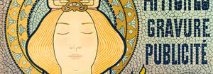
The Quartier Latin Poster
Louis Rhead · 1890 · Vibrant Art Nouveau poster featuring a confident woman artist and bold Paris typography
Poster from 223,50 Kč · Framed from 397,33 Kč
Regular price From 149,00 KčRegular price -
Cie.Cle Transatlantique Poster
Fernand Le Quesne · 1901 · Elegant Algiers steamship poster with bold typography and Mediterranean harbor atmosphere
Poster from 223,50 Kč · Framed from 397,33 Kč
Regular price From 149,00 KčRegular price -
China, the overland route Poster
Unknown artist · 1950 · Mid-century China travel poster pairing temple imagery with a clean overland route map
Poster from 223,50 Kč · Framed from 397,33 Kč
Regular price From 149,00 KčRegular price -
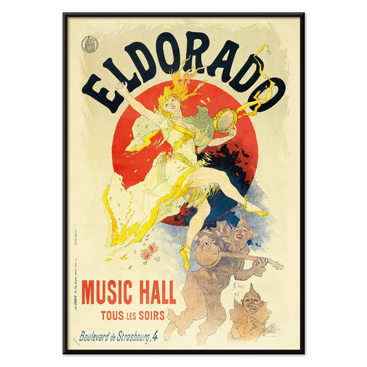
Eldorado Poster
Jules Chéret · 1894 · Spirited cabaret dancer poster with swirling yellow skirt and bold Belle Époque lettering
Poster from 223,50 Kč · Framed from 397,33 Kč
Regular price From 149,00 KčRegular price -
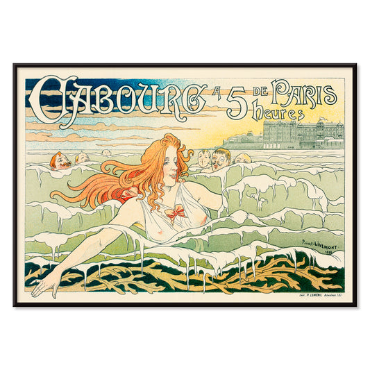
Casino De Cabourg Poster
Henri Privat-Livemont · 1896 · Art Nouveau seaside poster featuring a red haired swimmer amid rhythmic blue waves
Poster from 223,50 Kč · Framed from 397,33 Kč
Regular price From 149,00 KčRegular price -
The boat train Poster
Charles W. Holmes · 1925 · Dynamic Art Deco travel poster pairing a speeding train with an ocean liner
Poster from 223,50 Kč · Framed from 397,33 Kč
Regular price From 149,00 KčRegular price -
Ōkawa River Bridge Poster
Kobayashi Kiyochika · 1884 · Rainy riverside poster with bridge silhouettes and shimmering reflections in deep blue tones
Poster from 223,50 Kč · Framed from 397,33 Kč
Regular price From 149,00 KčRegular price -
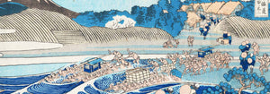
The Kiso Gorge in Snow Poster
Hiroshige II · 1859 · Serene winter landscape vintage print with a winding blue river beneath snow-covered cliffs
Poster from 223,50 Kč · Framed from 397,33 Kč
Regular price From 149,00 KčRegular price


- La Vie Parisienne Poster
- The responsive eye Poster
- Bex Brine Baths Poster
- Sanremo Poster
- Las Vegas – fly TWA Poster
- Souvenirs of My Travels Poster
- Morning Sea at Bikuni in Shiribeshi Poster
- Hawaii by flying clipper Poster
- The modern poster Poster
- City of New York municipal airports Poster
- Ocean Life Poster
- The boat train Poster
- The Kiso Gorge in Snow Poster
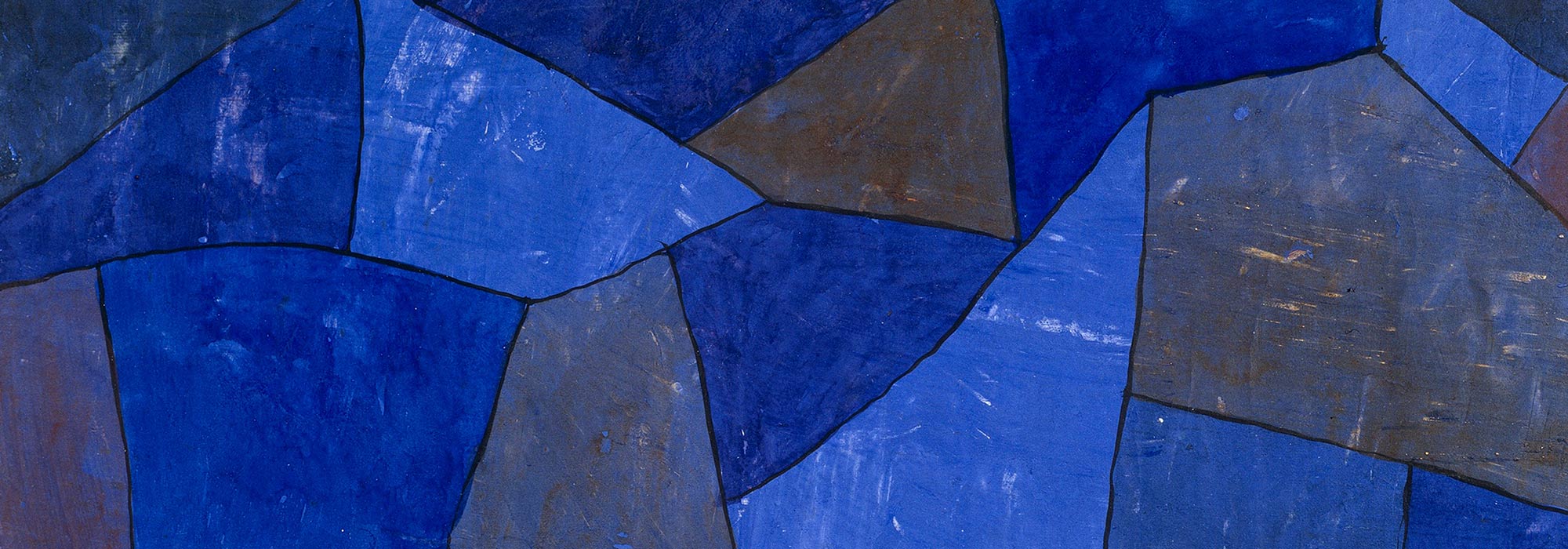
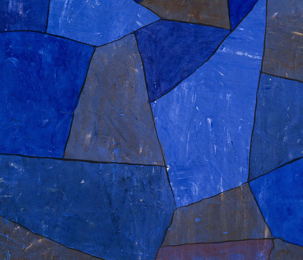
Blue as atmosphere, not just a hue
Blue rarely behaves like a single color. In vintage poster design it becomes distance, weather, depth, and even time, shifting from Prussian ink to pale sky wash as the subject changes. This collection treats blue as a structural element in wall art decoration: it can cool a room, clarify a line, and make paper feel archival. You see it in coastal imagery, in diagrammatic plates, and in graphic compositions where the blue field is the main event rather than a background. For adjacent moods, the pared-back restraint of Minimalist posters and the tonal focus of Black & White prints offer clean counterpoints.
Indigo, cyanotype, and the modernist sky
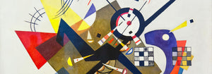
Historically, blue arrives through different technologies as much as through taste. Textile indigo moved between craft and industry, while cyanotype made photographic images from chemistry and sunlight, producing that unmistakable blueprint blue. William Morris’s Strawberry Thief (1883) sets rich indigo behind fruit and birds, turning repetition into a kind of domestic architecture that reads as both pattern and pictorial scene. Anna Atkins’s Fern (1850) cyanotype shows how the same color can act as evidence: the plant appears as a precise silhouette, halfway between specimen and lacework. In modern abstraction, Wassily Kandinsky’s Bleu de Ciel (1925) uses blue as a stage for floating signs, linking painting to the era’s fascination with music, science, and mapping the unseen. Related worlds of form and color sit in Abstract and Bauhaus.
Placing blue wall art in a home palette
In home decor, blue is easiest to live with when it is anchored by materials. Warm woods and sandy neutrals keep deep blues from feeling cold, while brushed steel and glass make pale blues feel deliberate rather than decorative. In an entryway, a blue print can act like a visual compass; in a bedroom, it reads as quieter when echoed in linen or a rug. For kitchens, blue beside white tile tends to feel crisp, especially when the imagery is botanical or cartographic. If you want recognizable subjects with blue emphasis, look toward Maps, Sea & Ocean, and Botanical; if the room already has strong color, a simpler sheet from Classic Art can keep the balance.
Curating: rhythm, scale, and framing choices
Blue makes curating easier because it can unify mixed imagery across a gallery wall. Start with one dominant piece, then add one or two quieter companions that repeat its temperature without copying its subject. Hokusai’s The Great Wave off Kanagawa (1830) is an obvious anchor: the wave’s blue is not atmospheric but architectural, built from carved contour and foam, almost like typography. Pair it with Kawase Hasui’s Morning at Cape Inubō (1931), where the sea is reduced to bands and gradients, creating a calmer cadence. To keep the set from becoming too nautical, insert a map plate or an abstract composition as a visual pause. Framing finishes also steer the mood: light oak keeps blues breathable, a white mat gives dark inks air, and a slim black frame heightens contrast; options live in Frames.
Blue as ink, dye, pigment, and data
What holds these posters together is not a single era or subject but the way blue carries information. It can read as craft dye, printing ink, mineral pigment, or scientific notation, which is why it fits rooms that mix ceramics, books, and travel objects without looking staged. As vintage wall art, blue often suggests both the sea and the library: a color associated with horizons and with study. That tension between sensation and structure is the collection’s real thread, and it is what makes blue feel steady in everyday decoration.